Discover Your Seasonal Color Palette Today!

Key Takeaways
- When you know color psychology, you select colors that stir up the emotions you want and reflect your personality, making your style come across as natural and self-assured.
- Keeping an eye on cultural significances and personal associations with color makes certain that your palette feels personal and speaks to your own narrative, wherever in the world you are.
- Determining your skin undertone and feature contrast directs you to colors that will naturally make you look good and feel confident.
- By trying a few different palettes, from seasonal to neutral colors, you develop a wardrobe that adapts to your evolving sense of style.
- Adding pops of accent color and clever accessories brings freshness and vibrancy to your ensembles, allowing you to make a statement without overdoing it.
- Steer clear of pitfalls such as overlooking undertones, fearing contrast or succumbing to trends by trusting your gut and making smart, individualized decisions.
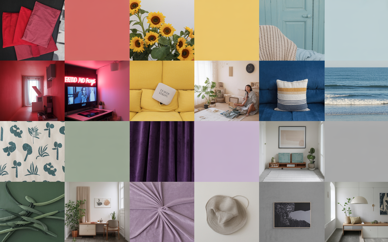
For your color palette, choose colors that align with your style, mood or brand objectives. A lot of people use a favorite object, or a picture or location for inspiration.
Some like to use online color tools or check out nature for fresh combos. Choosing your color palette will help establish the appropriate mood as well as keep things looking tidy.
Next, discover simple ways to determine the colors that suit you.
The Psychology of Color
Color is more than aesthetic; it influences our psyche and excites passion, reflecting significant aspects of personal color and identity. Understanding color theory can help you discover your capsule palette and its emotional effects.
Emotional Impact
Warm colors, like red and yellow, ignite energy. Red is notable for its robust association with passion, excitement, and even urgency. Yellow can bring a sense of joy or cheer, yet it's not often given as a favorite. It's bold and can illuminate a room or make a design pop, but overused, it can be fatiguing.
Cool colors, like blue and green, beckon calm and repose. Blue is constant too, appearing frequently in brands that seek to engender trust. Green's special for eyesight—it's the color the human eye reads most easily, and it's used in environments that require clarity, even night vision. Green is associated with growth and renewal, so it's a favorite for tranquil rooms.
Various hues can sway a mood. Soft purples, for example, counterbalance red's and blue's power. Purple tends to have a sense of both richness and tranquility, with undertones of both masculinity and femininity. Even gray, without allegiances, reads as contemporary and sophisticated. Brown indicates warmth but can feel heavy or nostalgic depending on its blend of red, yellow, and black.
Color selections steer decisions as well. Consumers are more apt to select brands whose colors fit the message. Recognition increases by 80% when the appropriate color is employed, demonstrating how much color affects decision-making.
Cultural Context
Colors can signify very different things globally, and understanding color theory is essential for designers. For example, red in certain cultures symbolizes good fortune and joy, while in others, it serves as a warning. Similarly, orange may signal friendliness in one nation but can be perceived as cocky in another. This highlights the importance of personal color analysis in creating designs that resonate with diverse audiences.
Traditions influence the appearance of colors in everyday life, impacting everything from festivals to dress codes. For instance, while white may symbolize purity in some cultures, it represents mourning in others. This cultural context is vital for designers when selecting their color schemes.
History also plays a role, as wars and social movements can shift perceptions of colors over time. Designers must be aware of these changes, as a hue that seems warm and welcoming in one culture may communicate a chill in another, making it crucial to understand the seasonal color palette associated with their target audience.
Personal Expression
Color is among the easiest means of expressing your identity. It turns into a color statement for your style and attitude. Sporting hot pink can indicate playfulness, or green can convey eco-conscious, but if you're wearing gray you probably favor minimalist design.
Experimenting with color combinations is the best way to determine what's comfortable. Eventually, you may find yourself gravitating to specific tones when you want to feel daring or serene.
Wear clothes in colors that flatter you and can elevate your mood, increase confidence, and either help you blend in or stand out.
Determine Your Color Palette
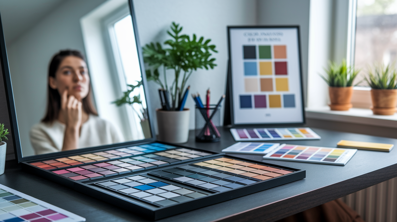
Determining your color palette is a process, beginning with your unique natural coloring–your hair, skin and eyes. The right palette guides you toward selecting garments that accentuate your assets. Everyone has a unique blend of colors, and identifying yours can simplify shopping and dressing.
Several employ a color analysis kit or test drive the 12-type system when standard "seasons" don't quite work. Below are steps to help you narrow down your best shades:
- Identify your base coloring: hair, eyes, and skin
- Use a color analysis kit for more accuracy
- Test colors in natural light
- Cross-check against seasonal and 12-type systems if desired.
- Document your results for future reference
- Refer to your notes when picking clothes or makeup
1. Analyze Undertones
Begin by determining your skin's undertone—warm, cool, or neutral. This tiny little piece of information transforms everything regarding what colors suit you best. To figure this out, hold some colored paper or fabric up to your face in daylight.
Which colors make your skin glow versus those that make you look dull? For instance, warm undertones tend to look stunning in earthy reds, browns and gold, whereas cool undertones shine in blue-based shades such as sapphire or icy pink.
A color wheel is useful here, when you want to check which shades compliment or contrast your undertones. Attempt a few in natural light – test. Observe which colors appear to seamlessly blend in and which really pop too much. This little habit can save you from making errors purchasing new clothes.
2. Assess Contrast
Contrast is a measure of the difference between your hair, skin and eye color. Others, such as light skin and dark hair, are high contrast. Others, with soft brown hair and beige skin, have low contrast. Understanding your contrast level guides you in whether you should wear saturated, vibrant colors or muted, blended hues.
Creating a visual chart can assist you in understanding your personal contrast levels. Put pictures of your face alongside swatches of color, and record which work best. If you're high-contrast, crisp colors work — black and white, for example.
If you're low-contrast, soft grays and taupe might work better for you. The trick is to select shades that suit your own palette, not the trend du jour.
3. Perform a Drape Test
A drape test involves holding up different-colored fabric swatches to your face and observing how your skin responds. This on the ground approach is among the most illuminating ways to discover what really works for you, outside of concept or charts.
After all, sometimes the colors you think will look best on you don't, and a surprise shade becomes your new go-to. Make notes on your exam. Record which colors make you look vibrant and which ones appear to exhaust you.
Utilize an easy chart or even just a notebook. Eventually, you'll develop a defined color palette that suits you. This makes you shop smarter and feel better about it.
4. Trust Your Intuition
Trust your instinct and experiment with personal colors; let your palette guide your fashion color choices.
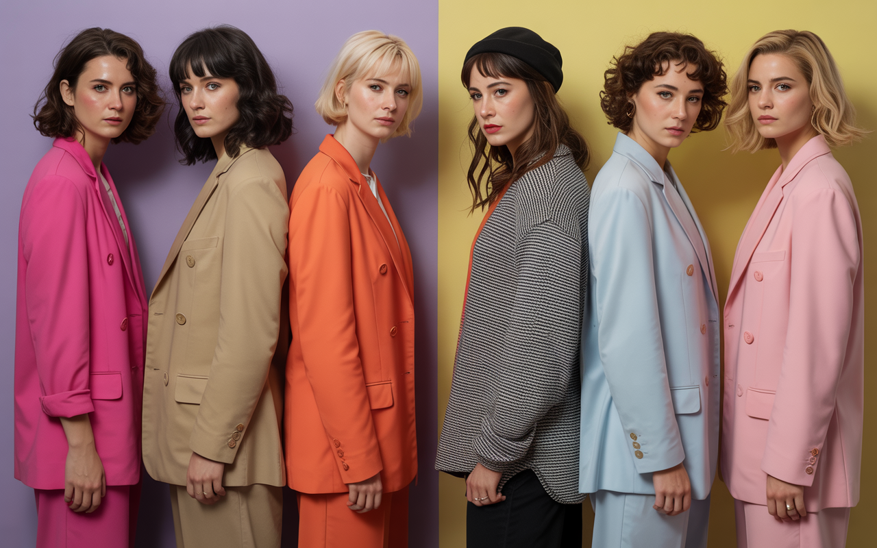
The Four Seasonal Palettes
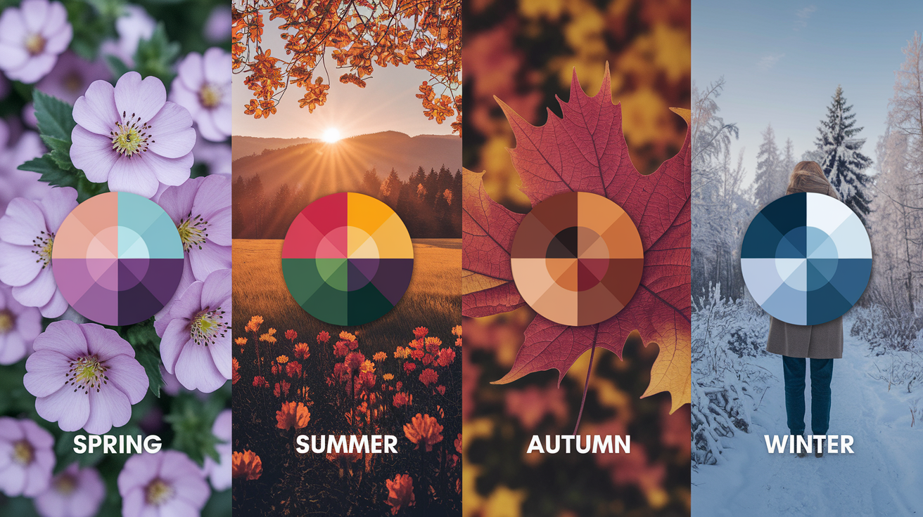
Seasonal color analysis associates your natural coloring with one of four palettes – spring, summer, autumn or winter. Each palette is inspired by the colors of its corresponding season, filtered through the undertones of your skin, hair, and eye color.
These palettes assist you in selecting shades that enhance your features, give you a healthy glow, and make building a coordinated wardrobe simpler. The palettes aren't cast in stone — they can shift with trends or as you age and evolve and hone your style.
Spring's Vibrancy
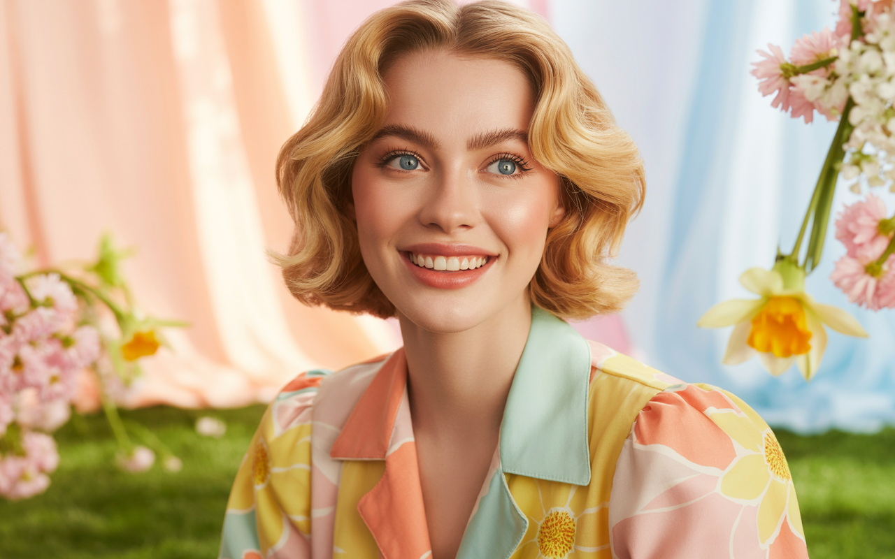
Spring colors buzz with cheer and lightness. Imagine fresh leaves, tulips, and that first sun post-winter–a palette rich with pastel blues, fresh green, peach and sunshine yellow.
These colors have warm, golden undertones. They're perfect for light or clear coloring and excellent at making ensembles pop. Pairing pastels with brights keeps looks playful, not shrill.
Team soft coral with mint, or daffodil yellow with sky blue for a lift. Light fabrics and florals reflect the fresh, airy qualities of spring. Even easy pairings, such as a pale pink top with white pants, emit energy.
Summer's Softness
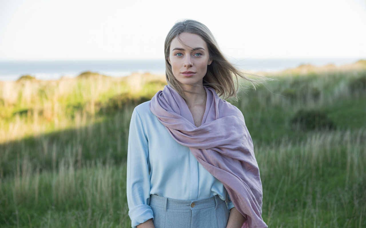
Summer palettes are cool and soft. Soft rose, lavender, cool aqua and muted sage resonate the wonder of endless summer days.
These hues suit those with cool or ashy undertones and lighter hair. The objective is a refined yet relaxed vibe. Layering is the secret.
Light cotton or linen keeps you cool and comfy. Match a pale blue blouse with light grey pants, then cap it off with a scarf in soft lilac. Don't sweat matching—muted tones meld together effortlessly and maintain the peace.
If you desire more dimension, combine pastel hues with a dash of navy or dove grey.
Autumn's Richness
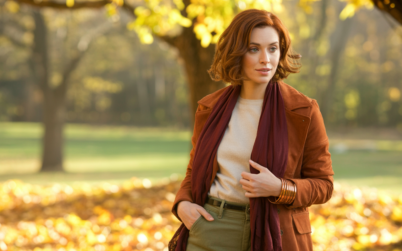
Autumn is the colors of earthiness, warmth and depth. Imagine leaf piles, berry jams and fireside snuggles—burnt orange, olive, deep gold & chocolate brown.
These shades have golden undertones and suit those with rich warm coloring the best. Textures count as much as color. Chunky knits, suede and leather add dimension.
Try wearing a rust jacket over a cream sweater, with olive trousers. Top it with a mustard or burgundy scarf for extra cozy. Copper or amber accessories pull out the richness.
Autumn colors are deeper and more muted than spring — just right for anyone who loves coziness without sacrificing style.
Winter's Clarity
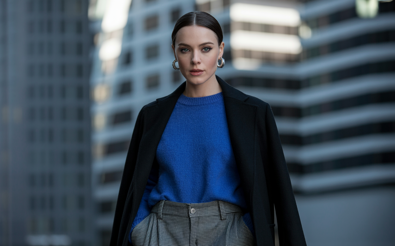
Winter palettes are sharp and crisp too. Cool undertones dazzle with daring reds, icy blues, emerald or crisp black and white.
These colors are most flattering for those with high contrasts in their coloring—dark hair, pale skin or piercing eyes. Layering plays nice here, too.
Opt for a basic black coat on top of a jewel-hued sweater, with charcoal pants. Checks or houndstooth or something adds a flair. Fabrics need to be cozy yet smooth, like wool or cashmere.
There's a distinctness to each color that really makes the outfits feel punchy and sophisticated.
Beyond the Seasonal Rules
Conventional seasonal color rules try to pigeon-hole you into wearing or disallowing certain shades based on a static set of characteristics. Depending too heavily on these rules can stifle creativity and individuality. It discounts how color sounds or how it lives within your actual life.
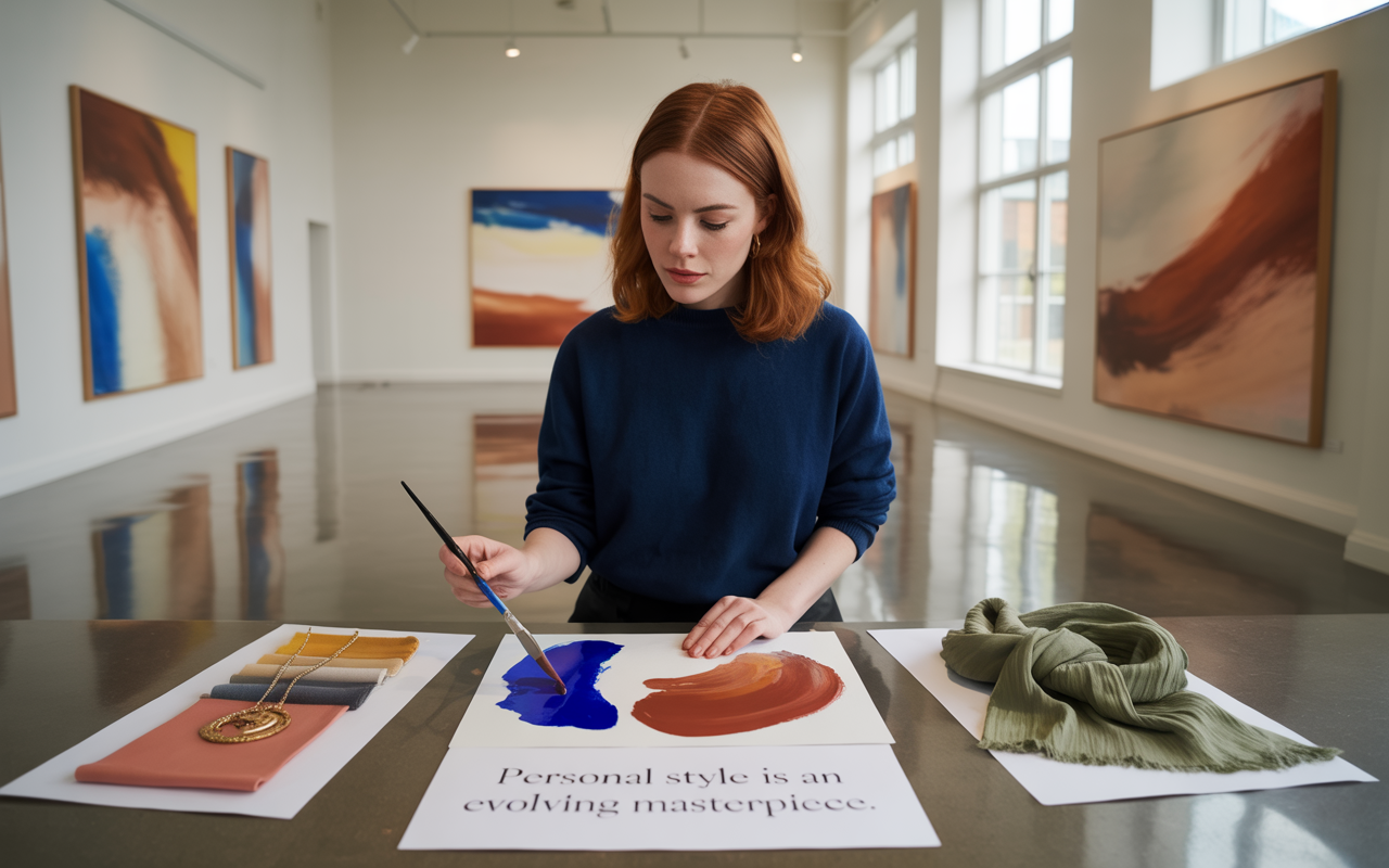
Personal style evolves, so should your palette. Blending hues from disparate seasonal palettes can freshen and personalize your appearance, and every now and then, you'll discover a color beyond your "class" that simply clicks. A versatile wardrobe allows you to experiment as your style and requirements evolve.
Your Unique Flow
The optimal color scheme begins with your daily existence. Consider your work and hobbies and how you allocate your time. If you're shuttling between boardroom meetings and farmer's markets your palate is probably working double duty.
Let your character come through. If you adore bolder, brighter shades, throw in a punch of red or cobalt blue even if the 'experts' say they don't suit your season. Perhaps you're attracted to sage greens or burnt golds because they resonate with a location or moment in time.
Color analysis is an aid—employ it to steer, not steer you, as you make your selections. Life evolves, style evolves. Your go-to colors at twenty might not be your go-to colors today, and that's OK. Inspiration is all around—peek at art, nature, or even street style for fresh shades that resonate.
The Power of Neutrals
Neutrals are the foundation of any closet. Cream, navy, tan and gray are shades that play well in just about every environment and can really compliment the best of brights.
Pair a crisp white shirt with a splash of emerald or a plain beige dress with a gold scarf. Neutrals offset brights too, so your outfits come across stylish, not noisy. Not every neutral works for everyone — some people look drained in cool gray, but radiate in warm taupe.
Select those that complement your hair and skin tone. A closet anchored by a few key neutrals makes mixing and matching simple. That way, even if you throw on a hot color, the entire ensemble still feels cohesive.
Integrating Trends
Fashion is ever-changing. You could be, say, exposed to a ton of lime green one season, that doesn't mean you have to dress yourself from head-to-toe in it.
Test it out as an accent–perhaps a scarf or a shoe–before you dive in. This keeps your style fresh but still authentic to what you love and what suits you.
Check your closet prior to purchasing that new fashionable hue. Will it blend in? Does it conflict with your basics? So use trends to update your look, not to reset each season.
Building Your Wardrobe
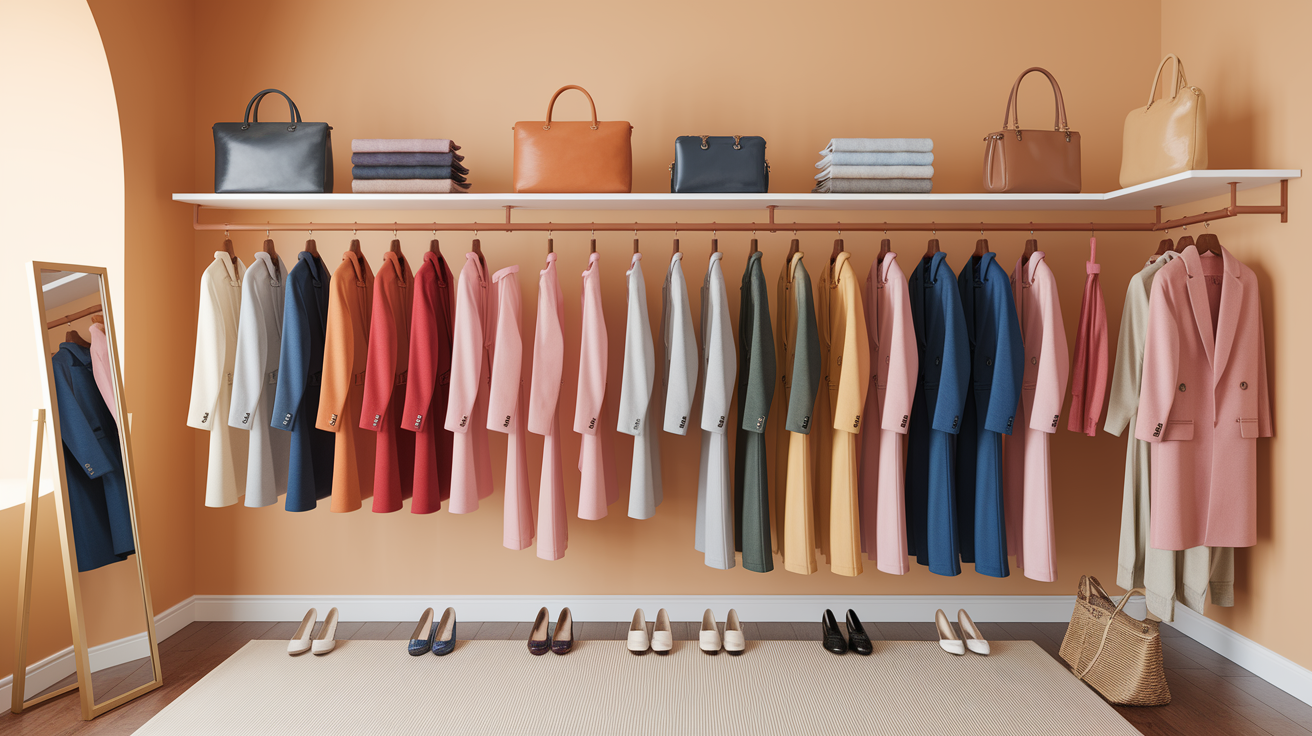
The foundation of a killer wardrobe is a defined color palette that complements your coloring and style. When you know your best colors—based on your hair, skin and eye color—it makes shopping simpler. Using the four season method (Spring, Summer, Autumn, Winter) can assist, although some individuals are in-between seasons.
Your color palette can evolve seasonally or as your features evolve. Others like to maintain a capsule wardrobe for 3 or 6 months, exchanging pieces and tweaking color palettes.
Core Pieces
These core pieces are the backbone of any wardrobe. These are the pieces you turn to again and again—imagine a crisp white shirt, tailored black trousers or a dark wash denim. Selecting these essentials in colors corresponding to your palette ensures they'll look good on you whenever you don them.
Buy less, buy better. A quality blazer or timeless trench in a neutral color—navy, gray, beige—lasts for years and pairs well with numerous ensembles. Always shop for fit and feel. A shirt that fits your shoulders and a pair of pants that sit right on your hips will always look better, even in a plain color.
Your core pieces should also reflect your own style. If you're into soft pastels and gentle colors, go with those for your basics. If you find yourself attracted to brights or jewel tones, allow that to be your compass. No wardrobe feels right if the fundamentals don't resonate.
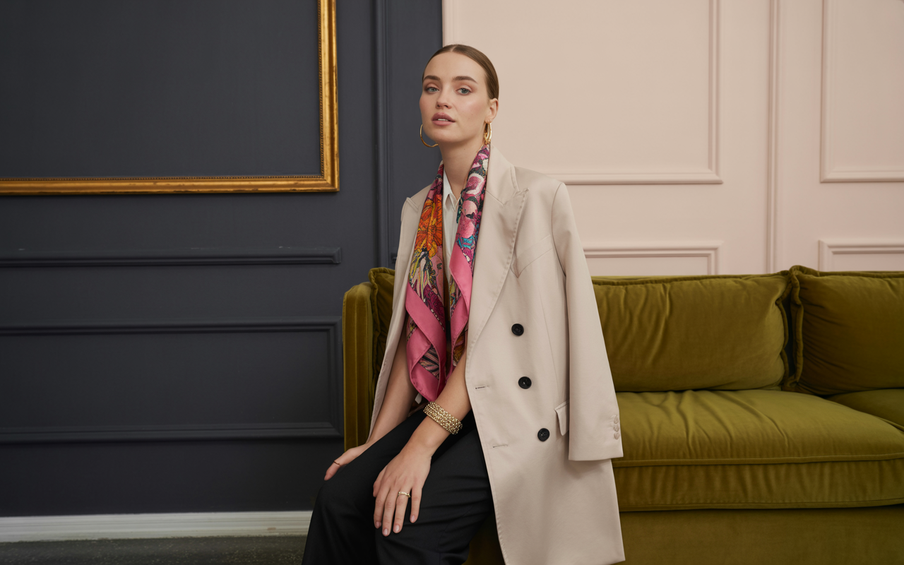
Accent Colors
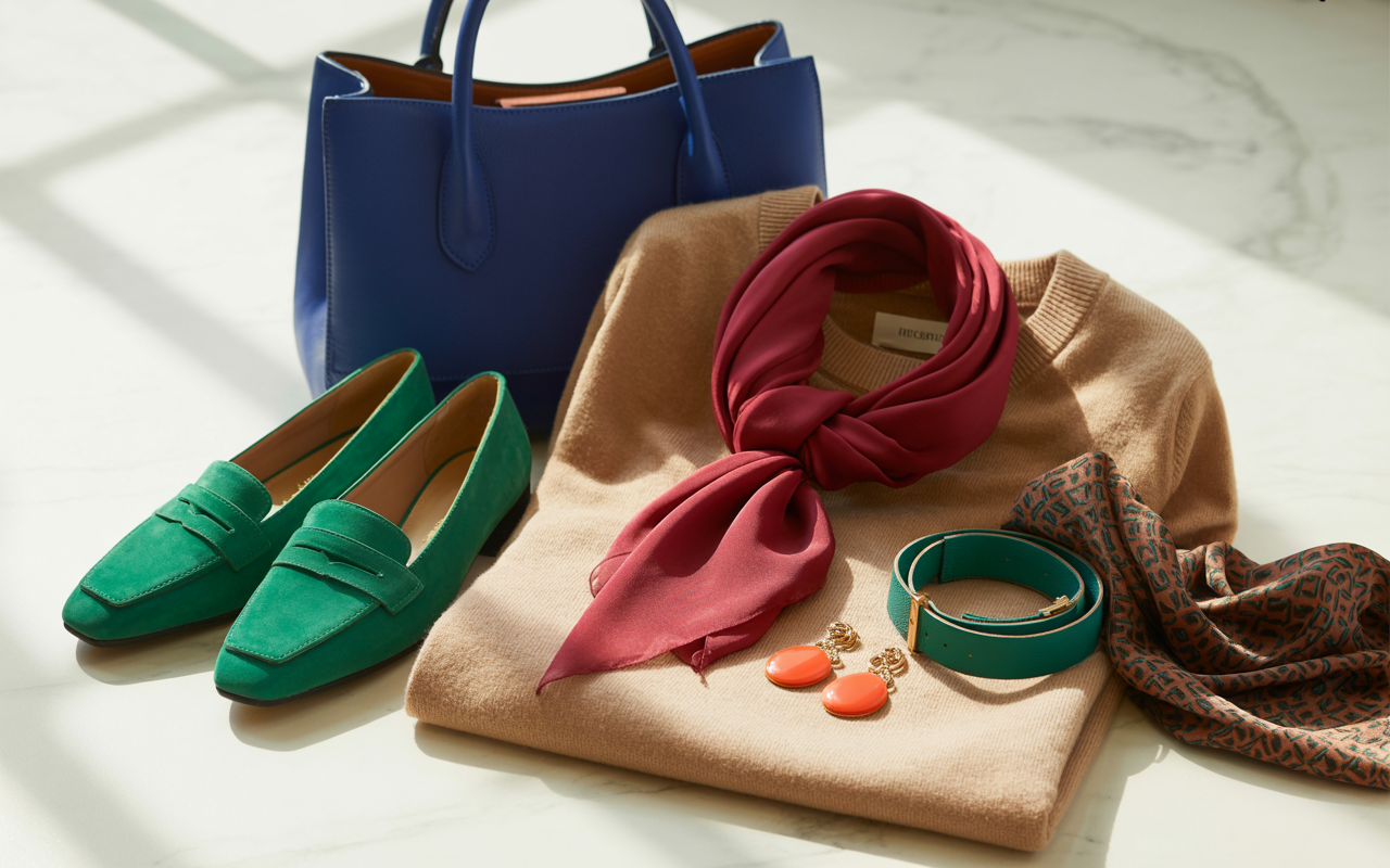
Accent colors inject life into a wardrobe. These tones are interesting and keep your style from sounding one-dimensional. Your best accent colors coordinate with your core colors and match your season, but don't be afraid to experiment with new ones as your style develops.
A red scarf or teal belt can flaunt your personality without dominating your style. Accent colors can shift by the season as well—sunny yellow in summer, rich burgundy in the winter. Stripes or florals in accent shades can go great for tops or skirts.
- Try a cobalt blue bag with a neutral outfit.
- Toss in a pair of emerald green shoes for that pop of color.
- Wear a patterned scarf that fits within your palette.
- Use statement jewelry, like these coral earrings, to liven up a look.
Accessorizing Smartly
It's an easy way to mix up your wardrobe and keep things fresh. Classic pieces—think: a leather watch or gold hoops—are seasonless and complement most color palettes. A perfectly selected bag in a signature color can pull an outfit together with very little effort.
Keep your accessory game in step with your wardrobe's color narrative. Swap scarves, hats or belts for the season to inject new energy. Don't hold on to too much – 40 pieces per season, including accessories, shoes and bags, keeps your style lean and streamlined.
Regular Rotation
Checking your wardrobe every few months keeps things current. Swap out tired pieces or add new accents seasonally to align with your personal color analysis. This keeps your wardrobe crisp and in sync with your capsule palette.
Common Color Mistakes
Selecting a color scheme is about more than selecting colors you enjoy. It requires foresight to steer clear of traps that can make a room or ensemble feel flat, clashing, or chaotic. By learning the most common mistakes, you can construct a cohesive, personal palette.
Some common mistakes include:
- Overlooking undertones in colors
- Avoiding contrast, leading to dull results
- Following color trends without considering personal style
- Relying on how colors look on screens only
- Using too many bold colors at once
- Forgetting to swatch before committing
- Not balancing bold and neutral tones
- Letting lighting conditions distort true color appearance
- Creating one-dimensional palettes without texture or depth
- Failing to coordinate colors across connected spaces
Ignoring Undertone
Your undertone is the silent partner in every color decision. Dismiss it and you risk being stuck with tones that drain your complexion and leave you looking worn out and washed out, regardless of how in vogue or high-end the item is.
Undertones are subtle, like the cool blue in porcelain or the warm gold in sand, but they make a huge difference. When you hold a swatch or fabric up to your skin, observe how it responds. Does it illuminate your face or throw strange shadows?
Swatching is required, be it a blouse or a wall color. If you don't know, test a few swatches in natural light. It's the finest way to view actual hues, and you'll find yourself drawn to those which simply 'ring true'.
Fearing Contrast
A lot of people are afraid of contrast, thinking it's too brash or dangerous. Playing it safe with only analogous, muted colors can suck the life out of your look or room. Contrast doesn't have to be black and white—it can be navy and cream, or olive and blush, or even matte and glossy textures mixed in.
Experiment with a vibrant scarf and understated jacket, or a rich green couch adjacent to light walls. These juxtapositions lend dynamic and make features pop. It's not about clashing, but about letting them all shine.
Even a small splash of contrast – a gold frame on a charcoal wall – can shake up a room or outfit. Contrast additionally helps punch up monotony! Next time you put together a look or decorate, push yourself to insert one high-contrast element. Go tiny, like a loud cuff or an ornate cushion, and marvel at how much zingier everything becomes.
Following Trends Blindly
Trends are fleeting, but your palette should feel fantastic all season long. It's tempting to pick up that "color of the year" sweater, but if it doesn't really fit your natural coloring or what you already have, it sits there unused.
Instead, consider how each new trend complements your wardrobe or décor. If a hot color pumps you, test it out as an accent—perhaps a throw pillow or scarf—prior to a major investment. Be true to your loves and requirements, but don't be scared to experiment.
Balance is key: a little trend can update your look, but too much can drown your style.
Digital Distortion
Colors are deceptive on screen. Lighting, camera settings, even your device can affect a shade. Never, never, never, never trust colors without seeing them in natural light when possible, and always order a fabric or paint sample before you make a final choice.
Don't rely on digital images. Trust your own eyes, and how a color plays off your space or your skin. Swatch in other rooms or at other times of day to save you from surprises. Your opinion and comfort is what's important.
Conclusion
Discovering your color palette catapults your style. It makes you shop smarter and dress more effortlessly. Colors establish a mood, communicate a message and highlight your best. Experimenting with soft blues for tranquility or bold reds for power can alter your mood in your outfit. No have to commit to a palette, however. Mix and match, experiment with new shades, and see what matches your mood or the day. Even a subtle update, like a fresh scarf or tee, can refresh your look. There are no style rules. Experiment with fresh shades, get friends' input, or take a picture to find what pops. Try it and love the difference.
Frequently Asked Questions
What is a color palette and why does it matter?
Your personal color palette is a range of flattering colors that complement your skin, hair, and eye color. Finding your palette enhances your wardrobe, making you look alive and feel powerful.
How can I determine my best color palette?
Begin with a determination of your skin undertone (cool, warm, neutral) using a color analysis camera. Try flattering colors next to your face in natural light; those shades that make your skin glow typically belong to your personal color palette.
What are the four seasonal color palettes?
They are Spring, Summer, Autumn, and Winter – the four seasons color analysis. Each season features a unique combination of undertones and contrast levels, along with a spectrum of flattering colors.
Can I wear colors outside my seasonal palette?
Yes, wear whatever color you love. To make unflattering colors work within your personal color palette, wear them as accents or away from your face to keep the balance.
What are common mistakes when choosing a color palette?
Typical mistakes in personal color analysis include overlooking undertones and choosing trendy colors instead of flattering colors that suit you best.
How do I build a wardrobe based on my color palette?
Select basics in your best shades from your personal color palette. Mix it up with accent shades from your capsule palettes, ensuring a cohesive and flattering wardrobe.
Does my color palette change as I age?
I know, your personal color palette might shift with your changing skin tone or hair color. Revisit your capsule palette every few years to confirm your flattering colors still suit you.