How to Determine the Colors That Flatter Your Skin Tone

Key Takeaways
- Identify your undertone using vein, jewelry, and fabric tests.
- Use seasonal palettes as a guide to simplify choices.
- Color psychology influences mood and perception.
- Build a wardrobe from core neutrals, main colors, and accent shades.
- Always evaluate colors in different lighting.
- Use modern digital tools to preview and save palettes.
Start by observing your skin, hair, and eyes. Some colors will make your features pop; others will wash you out. Easy tricks like holding up a shirt near your face or checking in natural light help too.
Identify Your Skin Undertone
One of the best ways to pick colors that fit you is to know your skin undertone. Undertone isn't about whether you're fair or dark-skinned, but rather what color lurks under the surface. The three primary undertones are warm (yellow, peach or gold), cool (pink, red or blue) and neutral (a balance of both).
Olive skin is special with warm and neutral undertones and a slight greenish tinge. These clues remain constant, even if your skin tone shifts with seasons or sun.
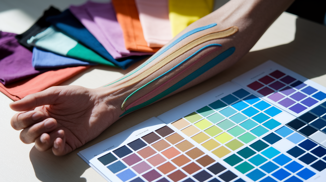
1. The Vein Test
Observe the veins on your inner wrist in daylight. Do they appear blue or green? Blue veins usually indicate cool undertones, and green veins reveal you possess warm undertones.
If your veins appear to be both blue and green, then you probably have a neutral undertone. This happy medium allows you to rock a variety of colors effortlessly. Others, such as stars Kerry Washington or Sandra Bullock, have a neutral undertone which means they can rock both bold and soft shades.
Once you check your veins, jot down what you observe. This easy trick provides you with a reference when shopping for clothes, makeup, or jewelry.
2. The Jewelry Test
Gold and silver jewelry can reveal a lot about your undertone! If you observe gold jewelry warms and brightens your skin, you have warm undertones. Silver jewelry suits cool undertones, giving your skin a fresh appearance.
Experiment with various types and metals of jewelry—rose gold, yellow gold, silver, or even platinum. Notice which ones make your skin appear even and glowing and which appear to clash or wash you out.
Make a list, or snap photos of your favorite jewelry selections. Maybe you discover that you always look and feel best in gold bangles or silver earrings and it can inform your style going forward.
3. The White Fabric Test
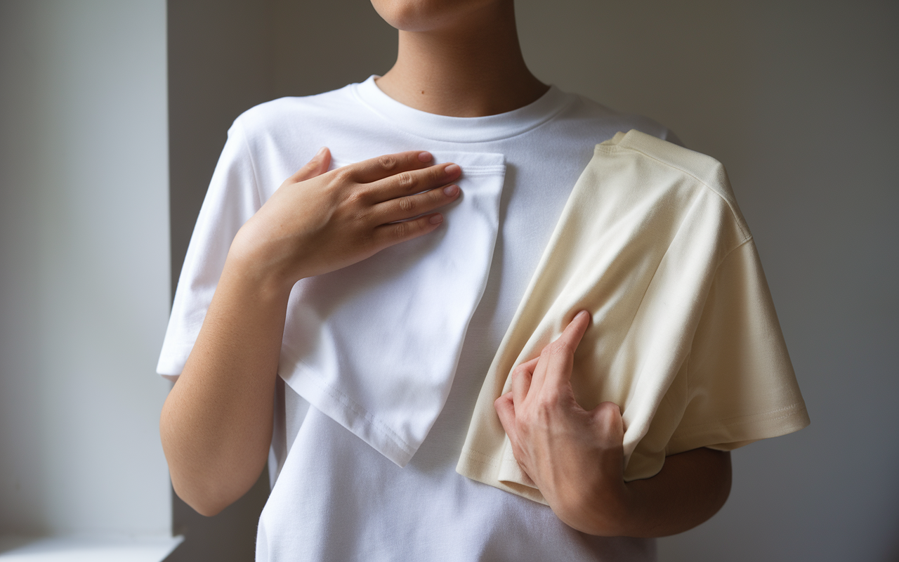
Take a simple white t-shirt and hold it up to your face. Stand in nice daylight, makeup-free. If your skin appears clear and vibrant you might have cool undertones. If your skin appears to radiate when paired with a cream or off-white fabric, this indicates warmth.
Most people use this test in conjunction with others, as white can at times emphasize cool tones and cream emphasizes warmth. Record what you notice in a notebook or phone.
Over time, these notes will help you notice trends in what tones suit you best.
4. Your Sun Reaction
If you tan easily, you might be warm. If you burn or pink up quickly, then you probably have cool undertones.
Observe if your skin changes with sun, but remember that undertone remains the same throughout the year. Take advice from this tip and select clothing that complements your natural skin tone.
5. Eye and Hair Clues
Your eye and hair color provide clues. Blue/green eyes and ash/platinum hair typically indicate cool undertones. Warm undertones appear in brown or hazel eyes and hair with golden or red highlights.
Enumerate your natural characteristics to assist identify your undertone. These hints will allow you select colors that flatter you season after season.
Discover Your Seasonal Palette
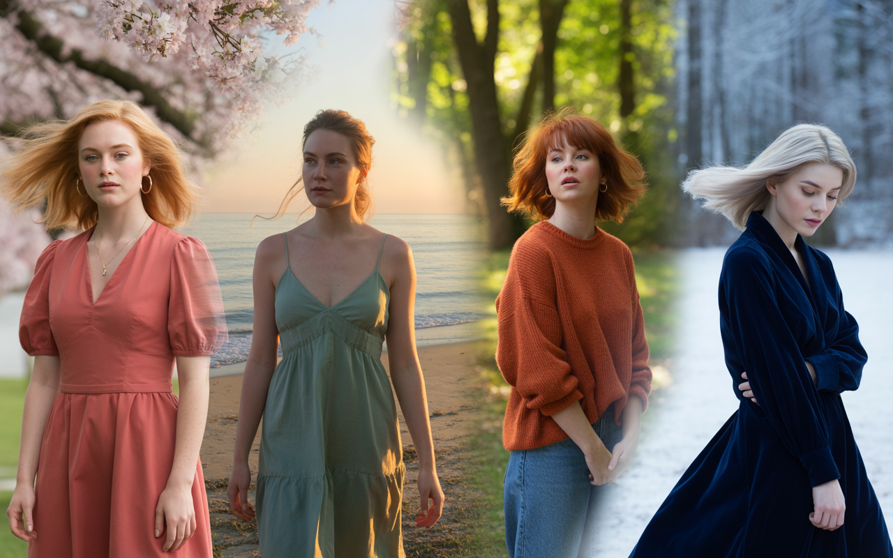
When you know your seasonal palette, it eliminates the guess work when choosing colors for your wardrobe. The seasonal color system, founded on four principals—Spring, Summer, Autumn, and Winter—classifies individuals by the undertones in their skin, hair, and eyes. Each season has its own shades, and while a number of them fall perfectly into one, some can straddle, or benefit from the extended 12-type system.
Seasonal color analysis is a guide—not a bible—but it can make shopping and dressing easier.
| Season | Undertone | Typical Hair Colors | Best Colors | Notable Subtypes |
|---|---|---|---|---|
| Spring | Warm | Light blonde, golden brown | Peach, coral, light green | Light, Clear, Warm |
| Summer | Cool | Ash blonde, light brown | Pastel blue, lavender, rose | Light, Soft, Cool |
| Autumn | Warm | Red, dark brown, auburn | Olive, burnt orange, mustard | Deep, Soft, Warm |
| Winter | Cool | Black, dark brown, cool blonde | True red, emerald, navy | Deep, Clear, Cool |
A color analysis camera, which is becoming increasingly prevalent in stores, can display how these palettes complement your features. This might require a bit of trial and error. For a few, color theory is confining, but for most, it's a way to trim the overwhelming array of flattering options.
If you fall between two seasons, that's fine—seasonal lines blur.
Cool Tones
Blues, purples and pinks likewise play well with cool skin. These tones tend to highlight the natural clarity in your skin. Jewel tones—think sapphire, emerald, and amethyst—are a popular choice for injecting a touch of luxe elegance.
Experiment with various cool tones in natural light. Some, such as icy blue, may make your skin glow while others, such as deep violet, might not. Tossing in these colors boosts confidence and reveals which ones accentuate your features best.
When you build your capsule wardrobe with cool tones, getting dressed is a breeze. Think navy, charcoal and soft lilac to begin your basics, then layer in bolder pieces like fuchsia or teal for your accents.
Warm Tones
Yellows, oranges and earthy colors compliment warm skin undertones. Hues like coral, gold and olive warm and energize, allowing your natural radiance to illuminate.
Blending in warm hues—hello, mustard, rust, and terracotta—that mirror your soul. These colors tend to play well with one another, so putting together an outfit is less stressful.
A wardrobe constructed around warm tones reads unified. A couple essentials—such as a camel coat, olive pants, or burnt orange sweater—do a LOT.
Neutral Tones
Neutrals–beige, taupe, soft gray–look great on just about anyone. They're the foundation of a versatile closet.
Use them as foundation layers, then introduce color with scarves, shoes or bags. As an example, a plain gray dress will really make a neon green necklace or red shoes pop.
Neutrals blend in nicely to all palettes. They can either make vibrant hues pop, or they can soften an appearance. Some even like a predominantly neutral wardrobe with one accent color.
Beyond Rules: Your Color Psychology
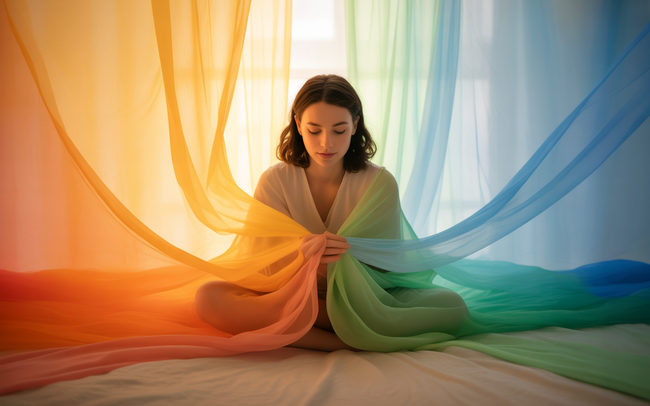
Color is not merely a fashion statement or a rule; it significantly influences your mood, self-perception, and how others perceive you. Understanding this can help you make selections that extend beyond the typical color schemes and instead focus on your perfect color palette.
Emotional Response
Think back to the last time you chose an outfit and rocked it. Odds are, it did some colors from your personal palette. Others, like orange, are warm and energetic, while blue elicits a calming sensation. Red can cause your heart to race, and green often feels secure and rejuvenating. Each of us responds to a color in our own way, influenced by memories or preferences, which can be explored through seasonal color analysis.
Your color response can vary by day. If you want to feel happy, try yellow; it adds brightness to the day, especially if it reminds you of sunshine or memories. Blue is a favorite because it's consistent and calming. If you want to stand out or feel bold, red or orange can provide that boost. Experimenting with different colors from your capsule palette on different days can lead to wonderful discoveries.
Observe how you feel in specific colors and note these tendencies. You may find you reach for green when you seek solace or white when you need a clean slate. This awareness will guide you in selecting your wardrobe intentionally, aligning with your unique color type.
Consider maintaining a little journal to track your experiences with various shades. Gradually, this practice aids in identifying what works best for you, helping you cultivate a wardrobe that feels just right.
Cultural Meanings
Color isn't universal, and understanding your personal palette can greatly enhance your wardrobe. For some, white is pure and innocent; for others, it's the color of mourning. In some cultures, red signifies fortune or festivity, while in others, it serves as a warning. By utilizing a color analysis kit, you can discover which colors resonate with your location or the message you wish to convey.
Discovering color symbolism across cultures is a means of honoring the world's diversity and can also guide your palette selection page. You might opt for blue to represent peace or green to respect the environment. Wearing meaningful colors can elevate your style and help you blend various shades in a way that is uniquely yours.
Blending colors across cultures will set your style apart! It's a way to honor tradition while also expressing your personal style. You don't need to abide by every rule, but understanding them enables you to select what resonates with you.
Colors carry different meanings across cultures; choose what resonates with your message.
Personal Expression
Color makes style you. Compiling your own palette is a reflection of your personality. Some enjoy blending vibrant hues, while others gravitate towards earthy tones or gentle pastels. There is no correct answer.
Try combining colors you wouldn't think to, like green with purple or orange with blue. You'll be surprised what you love. It takes time to create a color palette that resonates with you. Begin with hues that 'smile you into a standing height'.
Sprinkle in new tones once in a while. Save a note or picture of outfits that work, so you can reference them later when you need ideas.
Building Your Color Profile
Experiment with various shades frequently and record the flattering colors that make you feel great, seeking candid thoughts from friends.
Build Your Color Wardrobe
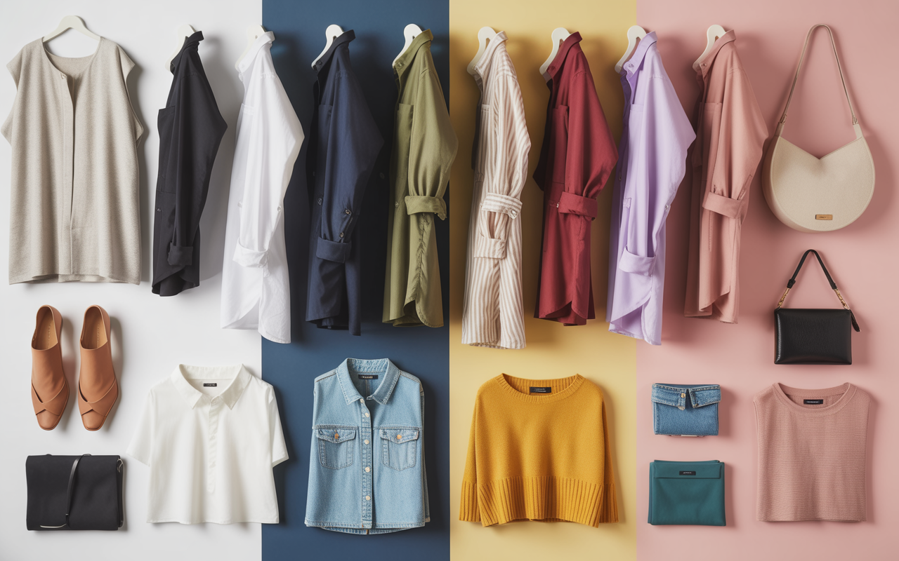
A color wardrobe is more than just a collection of pretty colors. It's a method of choosing clothing to suit your lifestyle, style and temperament. Knowing what colors look good on you saves time & makes getting dressed feel easy and fresh.
The secret is selecting a few neutrals, a couple of primaries, and a few accent colors. Here's a sample table for quick reference:
| Core Neutrals | Main Colors | Accent Shades |
|---|---|---|
| Black | Navy blue | Coral |
| White | Olive green | Mustard yellow |
| Gray | Burgundy | Teal |
| Beige | Soft lavender | Pink |
Core Neutrals
Core neutrals are your beginning. These neutrals—black, white, gray, beige—are good for just about everyone and match just about anything. They're the backbone of a color wardrobe because they never go out of style and because they temper bolder styles.
Select two core neutrals that complement your skin tone. For instance, warm undertones favor beige and soft white, whereas cool undertones dazzle in gray and crisp white. Neutrals can be worn head-to-toe for a polished look, or to anchor more punchy hues.
Even in small doses, the right neutral highlights your features. Always test these varied shades in natural light — see what works best for you and don't hesitate to swap out a neutral that feels dull or harsh.
Main Colors
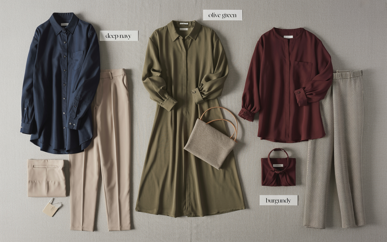
Main colors give personality to your wardrobe palette. Choose three that resonate with your style and complement your color season—such as deep navy, olive, or burgundy. These flattering colors should be easy to wear and mix well with both your neutrals and accents.
Mix primary colors with neutrals for fresh looks. For example, a navy shirt paired with beige trousers can be combined with a burgundy scarf for a slick, contemporary ensemble. Maintain a visual reference, like a color analysis kit or photos, so you don't forget your core colors when shopping.
This practice helps prevent you from purchasing pieces that won't fit your personal palette or lifestyle. A solid main color is something you actually grab for, not just one that looks pretty on the rack. Select colors that fit your daily lifestyle, whether for work, travel, or relaxation.
Accent Shades
It's the accent shades from your color analysis kit that truly bring your look to life! These playful, audacious colors, like mustard yellow or teal, are essential for creating a fabulous color palette.
- Pick 4 accent shades you love, something that makes your eye pop but still works with your style. These ought to illuminate your primaries and neutrals, not compete with them.
- Select hues with sufficient contrast to pop. For instance, mustard yellow pops against navy and gray, and teal looks sharp with beige or burgundy.
- Play with accent shades in scarves, shoes, or small bags to test them out. Even a trace of an accent color can transform your entire ensemble.
- Pay attention to what works. Make notes or pictures of outfits you admire, so you can construct new ensembles with your favorite accents.
The Impact of Light
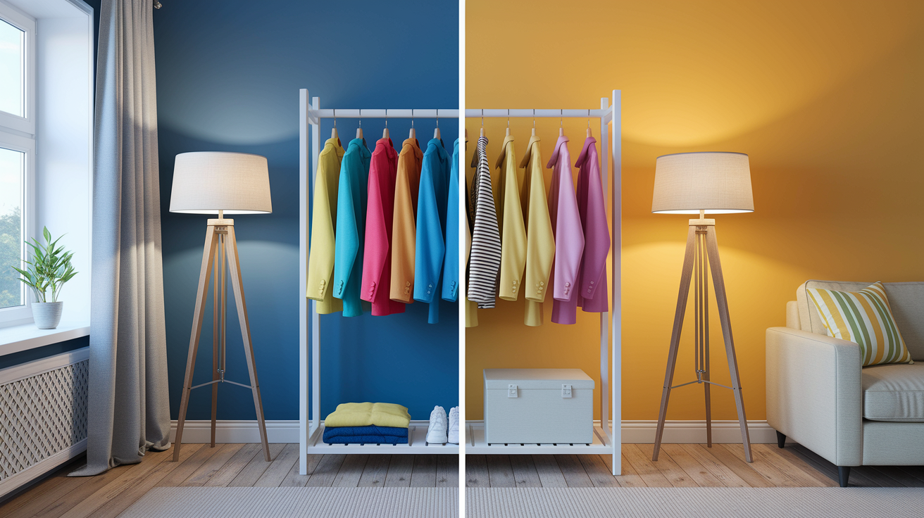
Light alters the appearance of colors on you, influencing your color type. It can make a shirt look bright in the morning sun but subdued at night. Understanding how various settings shift colors can assist you in selecting your perfect color palette, ensuring you choose clothing colors that suit your skin tone best, wherever you may be.
Natural Daylight
Colors reveal their true self in the natural light. To construct your own shade hit list, venture outdoors mid-morning or late afternoon. Hold up clothes or drape over your arm and check what compliments your skin. Blues, greens, and soft pastels frequently appear fresh and sincere outdoors. Earthy shades like olive or terracotta sparkle, as well.
If a color seems too severe or washes you out, jot it down. Gradually, you'll see a rhythm of what produces your best. Direct sunlight will assist you in determining how a color actually acts. It exposes undertones, allowing you to better discern if a red is leaning orange or blue, or if a white shirt is crisp or creamy.
Some discover warm colors make their skin look alive in daylight, while others shine in radiant blues or greens. Taking a selfie in natural light is a fast way to verify. Your phone camera picks up what the eye misses! Maintain a running list of colors that look best – on your phone or a small notepad. This list then becomes a great reference point for future shopping or outfit planning.
Artificial Lighting
Artificial lights can change colors. For example, a dress that appears bright blue in daylight might shift to grayish under a lamp. Incandescent bulbs tend to warm up colors and add some yellow or orange undertones. Fluorescent light in an office or a shop sometimes makes colors seem flat or faded.
So test your outfits in the lighting you'll be spending the majority of your day in. Test out various lights at home, or in fitting rooms as well. Look at what happens to your favorite shirt. Tweak your closet selections if you see a large swing—perhaps one green is more effective for nighttime events while one pink pops at brunch.
Record any surprises. Eventually, you'll get a pro at recognizing which colors to believe in any given environment.
Incandescent bulbs warm colors; fluorescents can flatten them. Evaluate outfits under the lighting you will actually wear them in.
Documenting Results
Jot down fast after testing outfits in fresh light. Even a couple words—such as "red shirt way too bright under store lights"—can save hours later. Check your notes every few weeks to identify patterns and refresh your personal palette with flattering colors.
Use Digital Color Tools
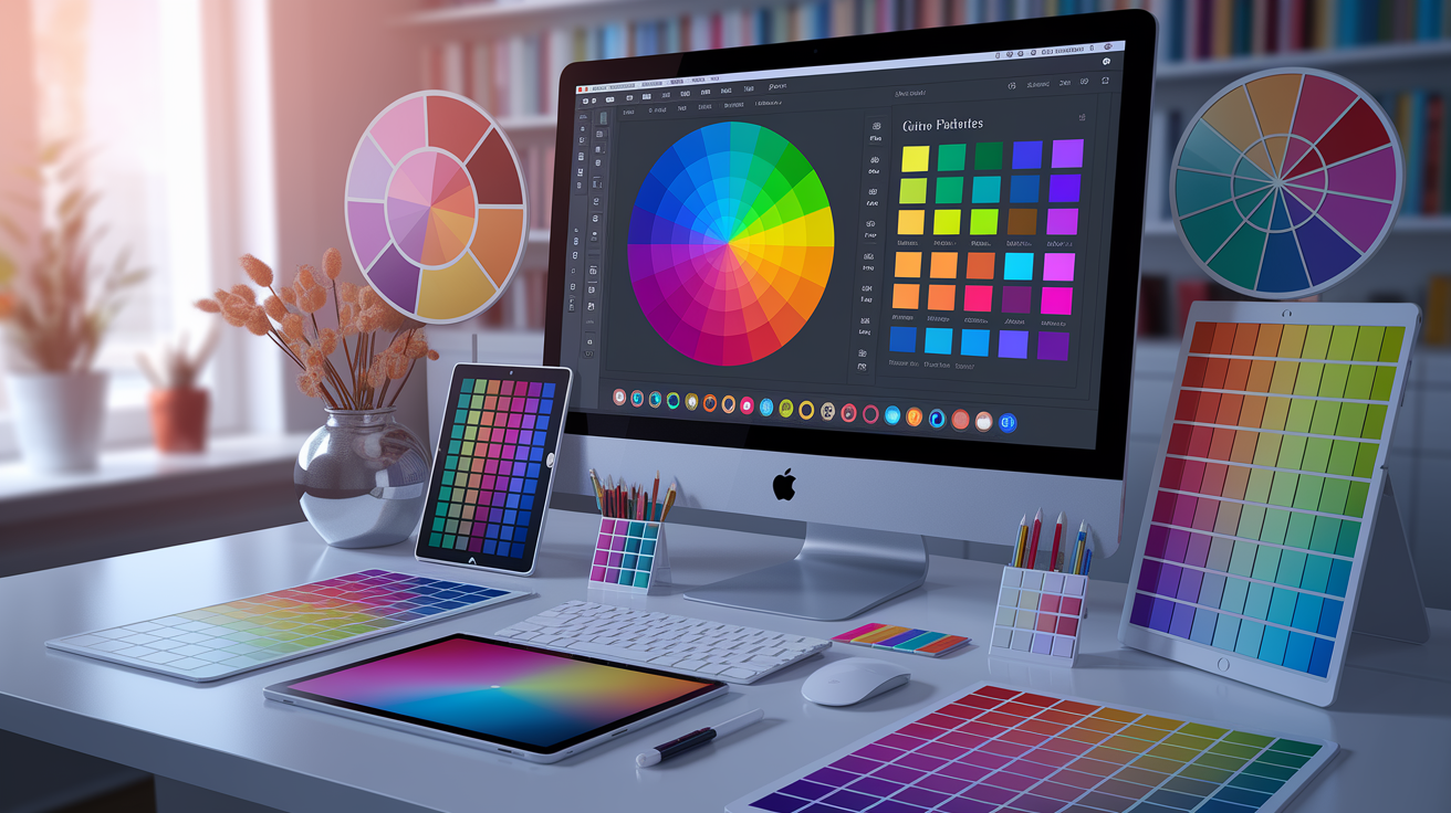
Digital color tools give you a universe of options for coordinating colors to your skin, style, and mood. These tools are not just for artists or designers; they are available to anyone who wants to use them to discover their perfect color palette that best flatters their features.
Color apps are all over the place now. Just tap to snap a bare face, and the app will recommend shades that complement your individual tone. It's quick and takes the guesswork out of shopping for clothes or makeup. The real win here is the preview section, which allows you to see how different color palettes can enhance your overall look.
Several digital color tools allow you to view a color on a virtual model or even yourself. You can experiment with a rich navy or muted gold and find out immediately if it conflicts or complements your wardrobe palette. For instance, a few apps allow you to modify the lighting or background to determine how a color shifts from day to night.
This is incredibly useful if you travel frequently or want to test how a color works in different environments. Color pickers and palette generators make it more. You can use a digital color wheel and experiment with primary, secondary and tertiary hues.
Use the sliders and play around to discover warm or cool shades that suit your skin. A color picker allows you to pick a color from a photo you adore and create your own custom palette around it. Palette generators take it a step further, displaying analogous, triadic, or tetradic colors that harmonize well together.
You can then save these palettes and use them as a guide when you shop — no more wondering if that coral top matches your beloved green scarf. If you like it simple, go monochromatic. Pick one base color and the tool will discover lighter and darker tones for a clean, cohesive look.
A lot of these digital color tools allow you to store your favorite palettes in your personal digital library. This proves convenient when you're on the go shopping or coordinating an outfit. Open your phone, check your saved colors, wrap up quick decisions.
Certain apps even allow you to share palettes with friends or stylists. You can maintain your look crisp and contemporary without overthinking. Some apps watch for accessibility as well.
I find this helpful if you want your style to read loud and proud in any group, ensuring that your color choices reflect your personal style and enhance your natural coloring.
Conclusion
Discovering what colors look good on you is almost like that perfect song for your mood. Begin with your skin tone, then experiment with color swatches or even photo try-ons. There's something about witnessing a bright blue shirt collaborate with your eyes or a soft green scarf illuminate your skin that lifts your spirits. Color commandments are a good guide, but your preference counts as well. Stand in the sun, take a few selfies, or have a friend's opinion. Something digital is useful if you want a jump start. Experiment with new hues, combine tried-and-true colors, and believe your eyes. Style doesn't come with a rulebook. Go experiment with a daring shade or a delicate wash and experience it. Show off your finds and come join the color chat.
Frequently Asked Questions
How can I identify my skin undertone?
Examine your wrist veins in natural light; blue veins indicate a cool skin tone, while green veins suggest a warm color tone, and a mix points to a neutral color palette. Your undertone guides you toward flattering colors that complement your overall coloring.
What is a seasonal color palette?
A seasonal color palette, integral to seasonal color analysis, categorizes colors into four seasons based on your undertone and features, recommending tones that enhance the natural color palette of your skin, hair, and eyes.
Do I have to follow color rules strictly?
No color rules are merely guidelines; personal preference and confidence play a crucial role in your wardrobe palette. Don't hesitate to choose flattering colors that resonate with you, even if they deviate from your custom palette.
How does lighting affect how colors look on me?
Natural and artificial lights play a role in shifting colors on your skin tones. To ensure you find your perfect color palette, be sure to check colors in different lighting to see how they really look before making a selection.
Can digital tools help me find my best colors?
Sure, digital color analysis tools and apps can rapidly propose appropriate colors by utilizing a color analysis kit, which suggests palettes that complement your skin tone and undertone.
Why is knowing my best colors important?
Wearing flattering colors that suit your personal palette can enhance your appearance, boost your confidence, and simplify the shopping experience, making it easier to create harmonious outfits.
Can everyone wear any color with the right styling?
We can all wear almost any color, particularly when using a color analysis kit to identify the right shades or combining them with core colors from your personal palette. Try to accessorize or layer so that even the most challenging colors work for you.