Your ultimate guide to finding your personal color palette

Key Takeaways
- Colors influence emotions, perceptions, and personal style—so making thoughtful color selections is important for expressing yourself and feeling confident.
- Finding your ideal color palette can be approached by determining your skin undertone, contrast level, and color testing to discover what best complements your natural features.
- Seasonal and 12-season color systems offer a framework for determining the palettes that will flatter you, but really just go with the flow.
- Using your palette consistently on wardrobe, home, and branding builds aesthetic coherence and reinforces identity across disparate aspects of your world.
- Knowing undertones, embracing contrast and keeping an open mind to change prevent common mistakes and keep your color palette relevant and flattering.
- Readers can make themselves beautiful and personalize their style by tracking their color finds, utilizing online apps, and updating their palette as tastes change.
To find my color palette is to select colors that complement my skin tone, hair and eyes. Folks employ color analysis to assist in deciding what to wear or design with.
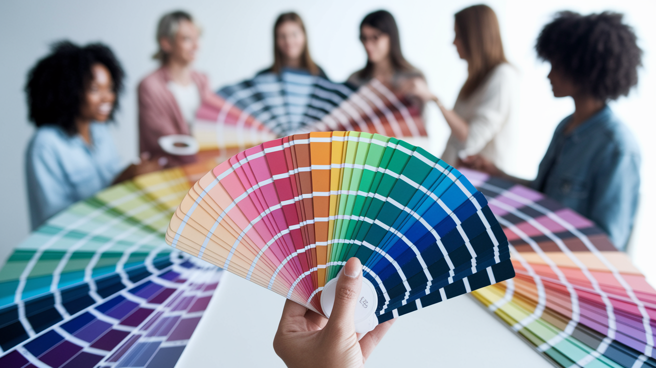
It can be tricky, and there are a lot of different ways to find your palette — online tools, color swatches, in-person advice. Most desire a palette for clothing, cosmetics or painting.
With the right knowledge about shades you'll style and confidence on your side, and you'll even save time!
The Power of Color
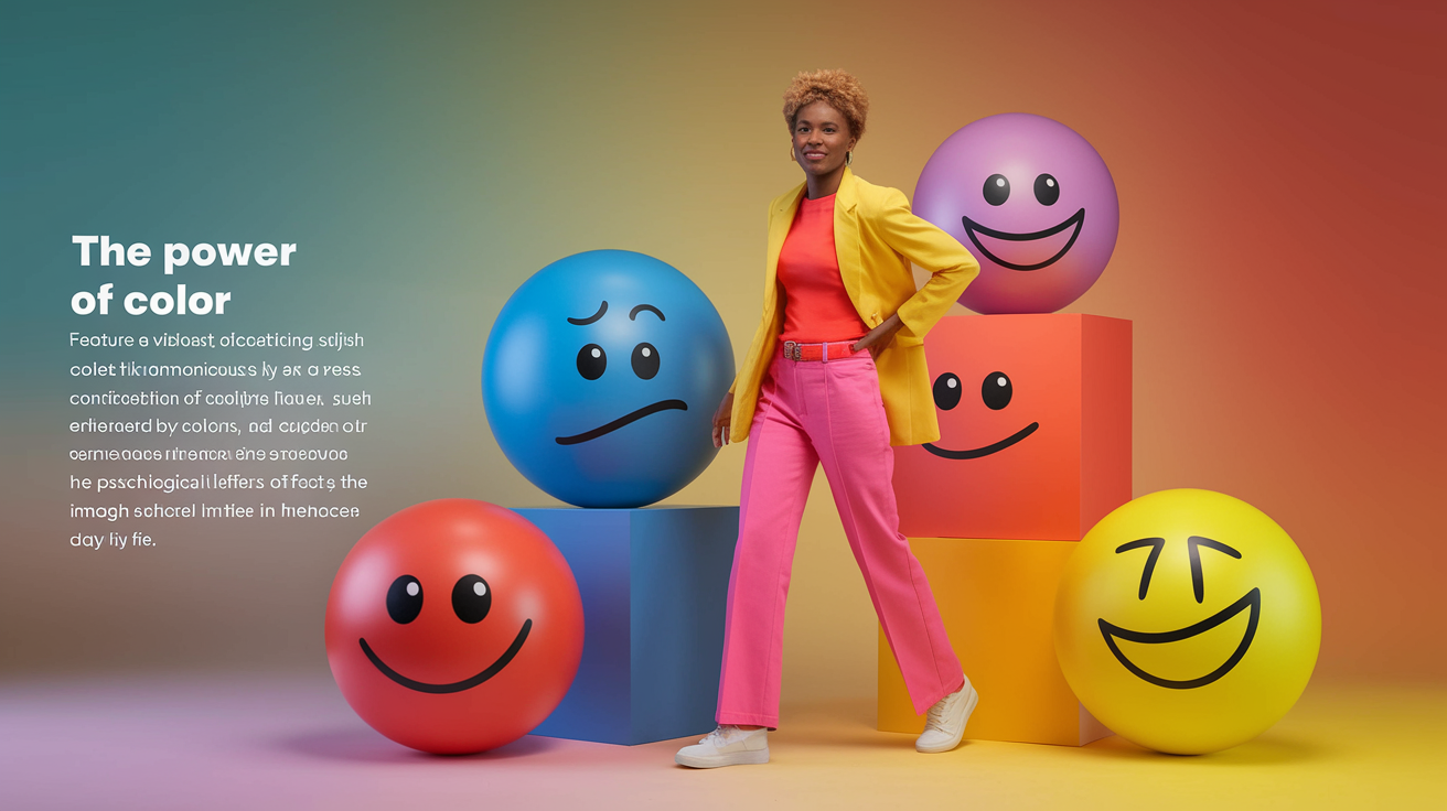
Color forms how we perceive and experience the world, influencing our choices in wardrobe and workspace. Utilizing a color analysis kit can help express your personality, enhance your confidence, and transform others' perceptions through effective color combinations.
Beyond Aesthetics
Color is not just about feeling pretty. It can arouse emotions, create ambiance and display nonverbal messages. Take, for instance, red, which typically represents energy and promotes alertness, and blue, which is associated with tranquility and trust.
In other cultures, white can stand for peace or purity, but in other areas, it can symbolize loss. What you choose can speak volumes about your principles, your disposition or even your profession.
Personal preferences for color can be a means of documenting what is important to you. One who selects a lot of greens may be trying to express an affinity for nature or equilibrium.
Color transforms how others perceive you. Wearing colors that clash with your skin can draw the wrong kind of attention and shift the equilibrium of your look. If you select hues that complement your features, you can enhance your style in a subtle way.
Mood and Perception
Various colors ignite specific emotions or responses. Yellow makes you happy and energized, gray makes you quiet or muted. That's why so many folks opt for soft pastels in soothing rooms and brilliant, bright colors in energizing spaces.
Color makes you remember as well. For instance, you may associate a specific blue with a beloved old sweater, evoking a cozy memory. Color can even affect the perceived size of a room.
Light colors can open up a room and add a feeling of airiness, while darker tones can create a snug cocoon-like atmosphere. Color even is employed to establish moods in work or home environments.
For example, light blue in a workspace can assist concentration, whereas an orange accent in a kitchen can bring the room to life.
Personal Harmony
A good palette matches your skin tone, undertone, and contrast. Choosing the right colors can make your eyes pop and your skin radiate. There are four main groups for color analysis: Spring, Summer, Autumn, and Winter.
Each has its own colors that suit its characteristics best. Spring and autumn are warm, summer and winter are cool. Warm types fare fine with gold and peach and cool types shine in blues and pinks.
In selecting colors, consider your power colors. These are the colors that correspond to your skin, undertone and contrast. If you are a high contrast, like dark hair, light skin, clear, bold colors work best.
For low contrast, muted tones play nicer. Discovering your own palette keeps your look grounded and centered, both in your clothes and in your house.
Visual Balance
Colors can collaborate or clash. When colors gel, they provide a feeling of harmony. Otherwise, the combination can seem off. That's why color harmony matters, whether you're choosing a shirt or painting a room.
Rocking your power colors in the real world can make you feel more confident about your decisions. They make you look polished without trying.
How to Find Your Color Palette
Finding your color palette is a stepwise process that begins with your natural features, such as skin tone, hair color, and eye color, and culminates in a collection of shades that feel both flattering and personal. Utilizing a color analysis kit can help you document your observations, creating a resource that aligns with your preferences and lifestyle for everyday application.
1. Identify Your Undertone
Begin by determining whether your undertones are warm, cool, or neutral, as this is crucial for selecting the best colors that flatter your complexion. A simple method to check is by examining your vein color: green veins indicate warm undertones, while blue or purple veins suggest cool. If you find it difficult to determine, you may have neutral undertones.
Try the jewelry or fabric test. Try holding gold and silver jewelry or varied colored fabrics up to your face. If gold looks better, you're probably warm, if silver looks better, you're cool. Neutral undertones could actually both wear!
Finally, match your undertone to colors for a look that's exceptionally flattering. Warm undertones shine in earthy tones like olive or golden brown, while cool-toned individuals look stunning in blue-based shades such as sapphire or icy pink. Understanding your undertones can guide you toward the right seasonal color palette for your unique style.
2. Determine Your Contrast
Compare the contrast of your hair, skin and eyes. High contrast (like dark hair and light skin) allows you to wear bolder, more dramatic hues, while low contrast (similar hair and skin tones) typically is most flattering in softer, blended colors.
Experiment with both high and low contrast looks. This practical method reveals what contrast level suits your natural coloring and personal style. A few mid-level contrast individuals can blend both for some flavor.
Let your contrast guide your closet. For instance, deep navy and crisp white for high contrast, or stone or blush for low. Record your results so you can select colors effortlessly down the road.
3. Perform a Drape Test
Collect colored fabric swatches and hold them up to your face in natural light. Observe the impact each color has on your skin tone. Certain clear, bright shades could make your features pop while others can leave you looking drained.
Take notes as you test each color. Does it make you feel alive? Assured? Any colors that make you look and feel your best should sneak their way into your palette.
The drape test is tactile and zeros in your options. It's handy for those whose coloring straddles two seasonal palettes, allowing you to test and discover the perfect blend.
4. Reflect Your Personality
Select colors that complement your fashion sense and personality. If you like bold, pick a few bright accents. If it's calm looks you like, go heavier on the neutrals.
Plug in your own favorite shades for a personalized palette. Color is not just aesthetic—it's identity.
Express your OWN personality with color. Consider how your colors serve your lifestyle and workspace. This keeps your palette grounded and authentic to you.
5. Use Digital Aids
There are online tools and apps that can assist you in trying out color palettes rapidly. There are lots of sites that allow you to upload pictures and determine what shades look good on you.
Online analysis services provide personalized recommendations, and digital color selectors allow you to create and save palettes. They're excellent for hectic lives.
Save your top shades online for convenient reference.
The Four Seasonal Palettes
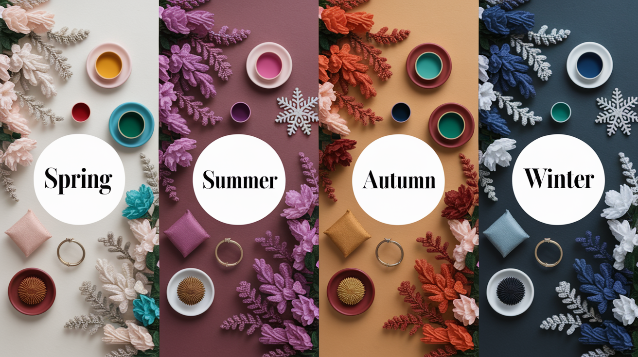
Seasonal color palettes provide a convenient means of selecting colors according to skin, hair and eye undertones. These palettes—Spring, Summer, Autumn and Winter—are based on how cool or warm and light or deep a person's features are. Most of us, however, use these palettes to inform our clothing, makeup and style choices.
Although a few of you may be able to identify your palette at a glance, for those with mixed or neutral undertones, you'll need to test a few before one clicks. Each palette contains signature colors and assists in curating a closet that just feels and looks right every day.
| Palette | Undertone | Depth | Typical Shades | Example Colors |
|---|---|---|---|---|
| Spring | Warm/Golden | Light to Medium | Bright, warm, fresh | Coral, soft yellow, mint |
| Summer | Cool/Ashy | Light to Medium | Soft, cool, muted | Lavender, sky blue, dusty rose |
| Autumn | Warm/Golden | Medium to Deep | Deep, warm, earthy | Terracotta, mustard, olive |
| Winter | Cool/Ashy | Deep | Clear, strong, vivid | Ruby red, cobalt, black |
The Spring Vibe
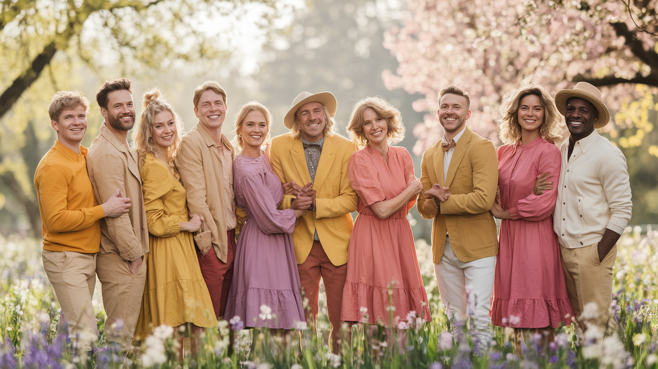
Spring just feels warm and alive. This palette is ideal for those with golden undertones and light to medium colored hair. Individuals comprised in this category appear amazing in vibrant, warm colors.
Think coral pink, peach, fresh green or soft yellow. These hues enhance a healthy glow and fresh-looking skin. It's effortless to mix and match within the Spring palette.
Make mint green and salmon a pair, or drape a bright yellow scarf over a cream top. The point is to maintain the look airy and festive, utilizing color to express vibrance.
The Summer Vibe
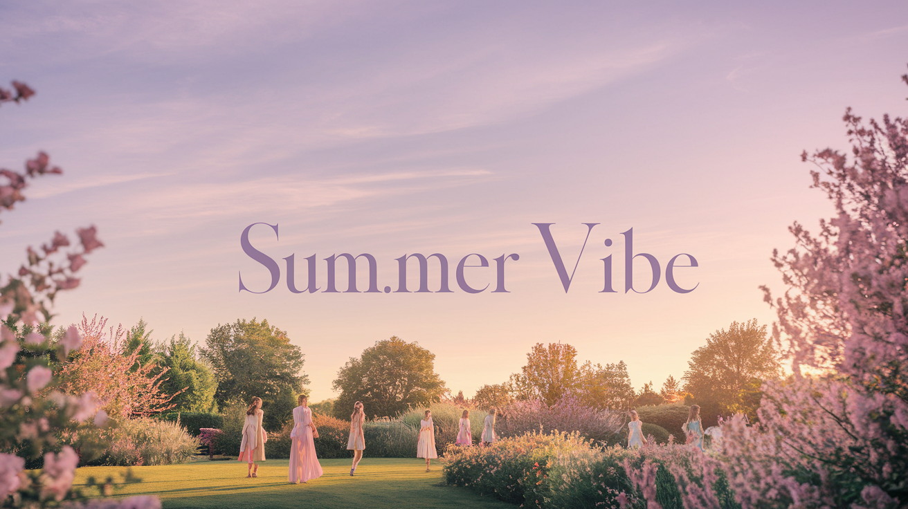
Summer's seasonal color palette is cool and soft, fitting light to medium features and ashy undertones. Colors like lavender, sky blue, and powder pink pop from this bunch, assisting in creating a calm mood ideal for work and casual looks. Using a color analysis kit can help identify these flattering colors for your personal palette.
Employ pastels for softness, and consider experimenting with color combinations; for instance, try combining dusty rose with a pale blue shirt or soft grey with light lavender. Summer colors mix well together, ensuring your outfit appears cohesive without being overly contrasting.
Certain neutrals can fall between Summer and Winter, making it essential to explore different colors to find what works best for your overall coloring.
The Autumn Vibe
The Autumn palette is rich, warm, and deep. Individuals with warm, golden complexions, dark hair or hazel and brown eyes usually appear most stunning in these shades. Autumn's palette boasts deep greens, olive, terracotta and mustard.
These tones provide a warm and earthy appearance. Burnt orange or deep brown, for instance, can be base pieces. Layer with a forest green scarf or rust red top.
Outfits mirror the richness of fall leaves and make warm skin tones pop.
The Winter Vibe
Winter palettes are about strong, clear, and cool shades. These folks typically have deep hair and skin with cool undertones. Vivid blues, ruby reds and crisp white are essential.
High-contrast outfits–black with white, cobalt with silver–look bold. A blend of Winter colors says crisp, clean. Even a single piece in a pop tone can elevate the look.
Beyond the Seasonal Model
The seasonal color analysis model — which is a popular model — actually doesn't account for the broad spectrum of human coloring. A lot of people think its four seasons—Spring, Summer, Autumn, Winter—are too few and occasionally confusing.
As time passed, specialists evolved the strategy to provide more granular models that accommodated individual characteristics and worldwide variations.
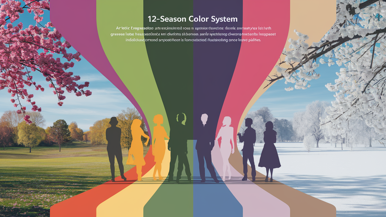
The 12-Season System
The 12-season system divides each main season into three sub-seasons, providing additional options. This assists individuals in discovering hues that complement their specific appearance.
Consider the table below for a quick overview:
| Main Season | Light | True | Deep |
|---|---|---|---|
| Spring | Light Spring | True Spring | Warm Spring |
| Summer | Light Summer | True Summer | Soft Summer |
| Autumn | Soft Autumn | True Autumn | Deep Autumn |
| Winter | Cool Winter | True Winter | Deep Winter |
This method allows you to pair colors to your skin, hair and eyes with greater specificity. For instance, a gal who rocks soft colours might be a Soft Summer or Soft Autumn.
Others might select Deep Winter for stronger contrasts. By blending the colors from different subseasons, such as combining Light Summer pastels with True Spring brights, you can keep your color palette exciting and original.
Your Unique Flow
No two individuals have the same blend of colors that flatter them most. Even with elaborate systems, personality characteristics–undertone, contrast, preference–still have a huge role in what works.
Others discover their prime hues by sampling colors from multiple families, not a single one. As your style evolves, so may your color preferences. You'll love bold reds one season and muted blues the next.
Jotting down what works as time goes on allows you to build a palette that complements not only your look, but your mood and lifestyle.
Cultural Context
Color means different things across the globe. For some, white is for weddings, for others it's for mourning. These associations can influence whether you feel comfortable sporting certain colors.
Style and design trends vary by location as well. For example, a vibrant pink may be prevalent in one area and uncommon in another.
With this knowledge, it's better to just pick colors that feel right for you and your culture. If a color holds strong significance where you live, incorporate it into your scheme if it resonates with you.
This ties your style to your heritage and personalizes it.
Applying Your Palette
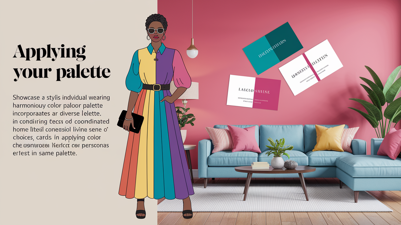
Applying your palette is more than selecting colors you love. Instead, the trick is applying YOUR palette in a way that works for your life, your style, your surroundings. Colors are dramatic; therefore, context is key. What works in a room or outfit may not work in another.
There's something satisfying about having a set palette; it brings balance, simplifies decisions, and makes your look or space feel cohesive.
In Your Wardrobe
- Opt for base hues such as black, navy or beige for classic styling.
- Blend in 2–3 accent colors that correspond to your season (Spring/Summer/Autumn/Winter).
- While shopping, choose garments that complement your palette—avoid spur-of-the-moment purchases in clashing colors!
- Use the 60-30-10 rule: let one color dominate, with smaller doses of others.
- Layer tones for depth—think a navy jacket layered over a white shirt with a red scarf.
- Construct your capsule wardrobe by echoing your dominant colors in multiple pieces.
- Via personal color analysis, figure out which shades best suit your skin, hair and eyes.
Sticking to your capsule palettes when shopping for clothes creates a closet where nearly everything matches, saving you time daily and reducing overall clutter.
In Your Home
A thoughtfully applied color palette can make a home feel serene or energetic. Begin with a dominant color that accounts for 60% of a room—white, gray or beige are typical for walls. Apply a complementary color for approximately 30%—bedding, rugs or curtains, for example.
Add accents in 10%—pillows, art or lamps. If your palette is warm, try yellow or terracotta as accents; for cool, use blue or green. Accent colors assist in emphasizing important areas, such as a red chair or blue vases, attracting attention without dominating the area.
Sample paint first to test how each shade plays in the light. Combine warm and cool hues for intrigue. Stay true to your palette for a more cohesive home.
In Your Brand
Branding requires color consistency. Apply your primary palette everywhere—site, social media, logos, packaging. Pick tones that match your message: blue for trust, green for calm, red for energy.
The 60-30-10 rule applies here as well, like 60% white, 25% yellow, 10% red, 5% blue and black, to keep visuals balanced. Test color schemes in digital mockups. If you have trouble picking, try a 12-type color system for more nuanced results.
Neutrals help logos and posts stay readable and professional. Colors should resonate with your target audience and align with your mission.
Experiment and Adapt
Experiment with combinations—alter accent colors or introduce a bold shade seasonally. Adjust your palette as your life or taste changes.
Switch between warm and cool tones for different moods. Consistency matters, but so does personal comfort.
Common Palette Mistakes
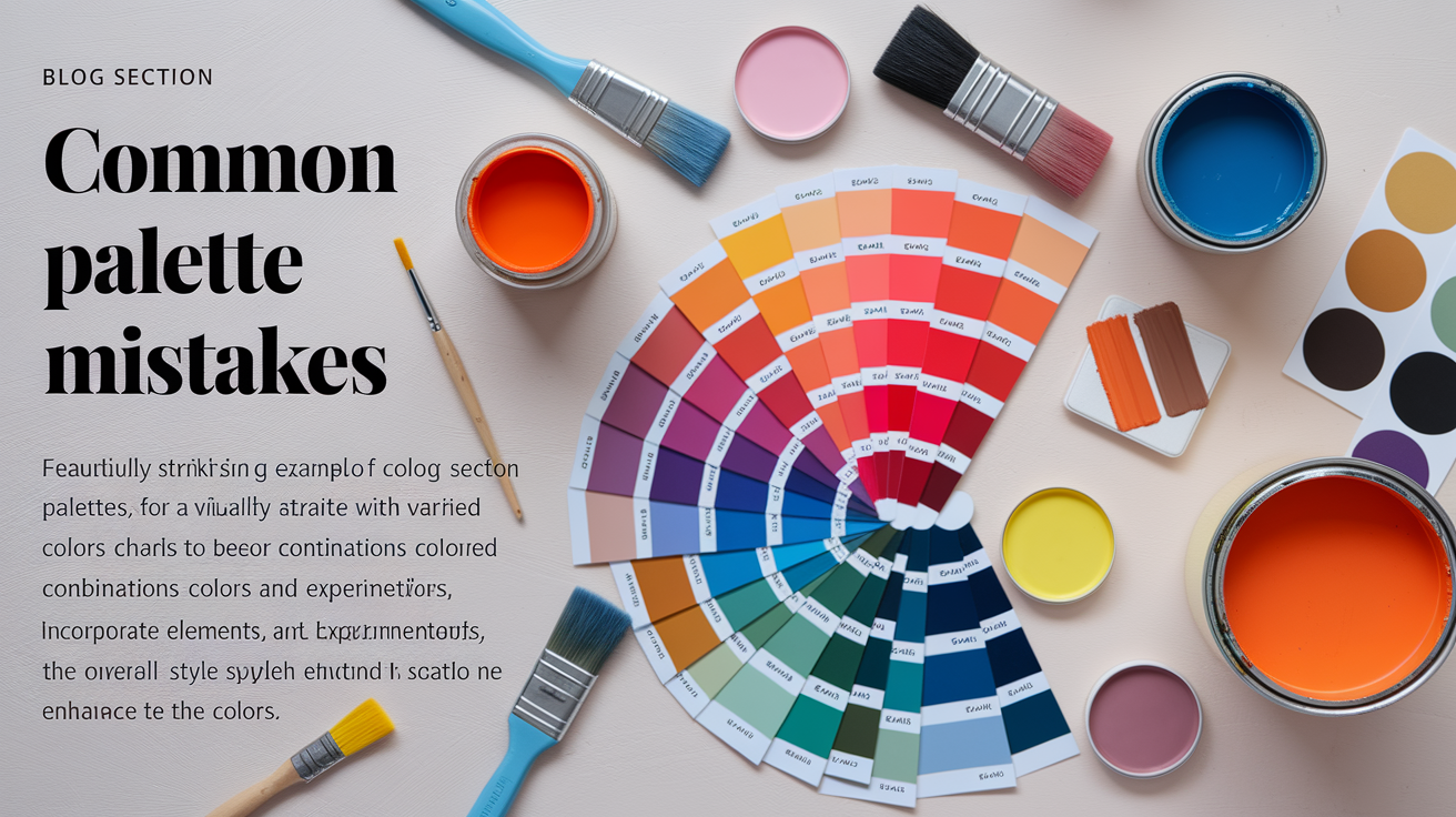
Selecting the perfect palette is about more than just choosing preferred colors; it involves understanding color theory and utilizing a color analysis kit. We all fall into the same pitfalls, which can leave styles feeling flat or clashing, so avoid these common mistakes for a more balanced and harmonious result.
- Overlooking undertones, leading to mismatched or unflattering results
- Including a mudslide of colors, turning spaces 'mushy'
- Ignoring the 60-30-10 rule for balance
- Using too many like undertones, resulting in a flat look
- Playing it too safe with neutrals or avoiding contrast
- Clashing colors by not understanding the color wheel
- Overusing one color, creating monotony
- Sticking with outdated palettes and resisting change
Ignoring Undertones
Forgetting about undertones can cause a palette to unravel. Undertones are like the colors under the surface of skin or paint, like a touch of pink, blue, or yellow. If you select colors without considering if their undertones are in harmony, they'll clash or wash you out.
Always keep your skin's undertone—cool (pink, blue), warm (yellow, peach) or neutral—in mind when choosing colors for clothing or makeup. Hold swatches against your skin to find out what looks best.
Don't trend-hop. A "trendy" color may appear fabulous on another but appear off if it's not aligned with your undertone.
Fearing Contrast
A lot of people shy away from contrast because they believe it to be dangerous. It's contrast that gives life and energy to a palette or an outfit. These high-contrast looks, like a white top with navy pants, really make features pop.
So does a room—throwing together light and dark, warm and cool, generates interest. Experimenting with like shades can make everything kind of run together, missing the opportunity to really accentuate your best features.
Play it safe and your style may never pop. Experiment with a strong accent color for 10% of your space or look. Even adding metallics can alter the vibe. Don't be afraid of color—make it your friend.
Resisting Change
A palette that worked five years ago can feel old now. By embracing new colors and experimenting with fresh combos, you can make yourself look more current.
It's wise to review your palette once a year or so. See if your faves still work! Experiment with blending old and new colors. Change doesn't mean abandoning what you adore, simply discovering methods to make it work for the present.
Other Common Pitfalls
Using too many colors with the same undertone makes a room flat. Too much of one tone can feel boring. Neutrals require attention—blend warm and cool for dimension.
There's no such thing as an ugly color, only bad matches.
Conclusion
Color defines your mood, defines your style and makes you feel fantastic. Choosing a color palette shouldn't feel difficult. See what feels right on you. Try a few shades on, see what pops. Seek out easy victories, like a shirt that makes your eyes pop or a scarf that highlights your complexion. If a color feels right, believe it. Don't worry about rules. Your palette needs to fit you, not vice versa. Color is fun, it's not about rules. Want to witness actual change? Test drive one new tone this week and see how you feel. Your best palette is a reflection of you —so be playful and make it yours.
Frequently Asked Questions
What is a personal color palette?
A personal color palette, derived from seasonal color analysis, is a group of colors that flatter your features — skin tone, hair, and eye color, assisting you in selecting outfits and cosmetics that highlight your best colors.
How do I find my color palette?
Determine your color palette through your skin's undertone and how certain colors appear on you, utilizing a seasonal color analysis based on the four seasonal palettes – spring, summer, autumn, and winter.
What are the four seasonal color palettes?
The original four seasonal color palettes—spring, summer, autumn, and winter—cluster colors by warmth and coolness, utilizing color theory to identify the best colors that pair well with specific undertones and features.
Can I use more than one palette?
Yup, a few folks believe they fit into more than one color type. Personal style and preferences will dictate your choices beyond the generic seasonal color palette models.
Why is it important to know my color palette?
Knowing your color palette allows you to choose clothes and makeup that complement your natural coloring, resulting in a cohesive appearance and increased confidence.
What mistakes should I avoid when choosing a palette?
Don't select colors simply based on trends; instead, focus on flattering colors that complement your undertone and natural coloring.
Are online color analysis tools accurate?
Online tools, like a color analysis kit, make a good jumping-off point, but face-to-face or professional analysis offers more accurate and individualized results.